A revenue cycle management logo represents far more than visual aesthetics for your healthcare billing organization. This essential brand element serves as the foundation of your professional identity, communicating trustworthiness, competence, and reliability to healthcare providers who depend on accurate billing services. For companies in the RCM industry, a well-designed logo becomes the cornerstone of brand recognition, differentiating your services in a competitive marketplace while building confidence among medical practices, hospitals, and clinics seeking comprehensive revenue cycle management services.
Understanding the Strategic Value of Your Revenue Cycle Management Logo
The healthcare billing sector demands exceptional standards of professionalism and accuracy. Your revenue cycle management logo functions as the visual ambassador of these qualities, creating immediate impressions during every client interaction. Healthcare providers evaluate potential billing partners based on perceived credibility, and your logo plays a significant role in establishing that critical first impression.
Brand recognition in the RCM industry directly influences client acquisition and retention. Medical practices receive numerous solicitations from billing companies, making visual differentiation essential. A distinctive, professionally designed logo helps your organization stand out in crowded inboxes, trade show environments, and digital platforms where healthcare decision-makers search for billing solutions.
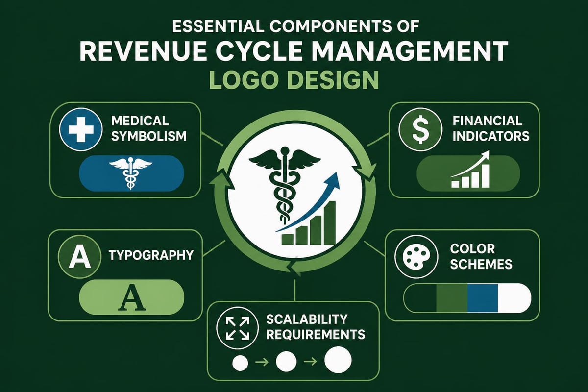
Core Elements That Define Effective RCM Logos
Professional revenue cycle management logos typically incorporate specific design characteristics that resonate with healthcare audiences:
- Medical symbolism: Subtle references to healthcare through crosses, heartbeats, or caduceus elements
- Financial indicators: Visual cues suggesting financial growth, stability, or cyclical processes
- Typography choices: Clean, readable fonts that convey professionalism and trustworthiness
- Color psychology: Strategic use of blues, greens, and neutral tones associated with healthcare and finance
- Scalability: Designs that maintain clarity across business cards, websites, and large-format materials
The intersection of healthcare and financial services requires a delicate balance in logo design. Effective logo design for the Revenue Cycle Management industry emphasizes professionalism while maintaining approachability, ensuring that healthcare providers feel confident entrusting their billing operations to your team.
Establishing Comprehensive Brand Guidelines for Logo Usage
Creating a revenue cycle management logo represents only the initial step in building a cohesive brand identity. Comprehensive brand guidelines ensure consistent application across all touchpoints, protecting your visual identity from dilution or misuse. These guidelines function as the rulebook for employees, marketing partners, and vendors who represent your brand.
Brand guidelines establish clear parameters for logo implementation, preventing inconsistencies that undermine brand recognition. For RCM companies, these standards prove particularly important when coordinating with healthcare clients who may need to reference your logo in their vendor lists, presentations, or internal documentation.
Essential Components of Logo Usage Standards
Clear Space Requirements
Defining protected space around your revenue cycle management logo prevents visual clutter and maintains impact. Standard practice establishes clear space equal to the height of a specific logo element, creating breathing room that enhances visibility. This spacing applies regardless of background color or surrounding content.
Minimum Size Specifications
| Application Type | Minimum Width | Minimum Height | Format Recommendation |
|---|---|---|---|
| Digital screens | 150 pixels | 60 pixels | PNG or SVG |
| Printed materials | 1.5 inches | 0.6 inches | Vector (AI, EPS) |
| Business cards | 0.75 inches | 0.3 inches | Vector or high-res PNG |
| Email signatures | 200 pixels | 80 pixels | PNG with transparent background |
These specifications ensure legibility across various applications, from medical billing service documentation to digital marketing materials. Smaller applications risk rendering fine details illegible, diminishing professional appearance and brand recognition.
Approved Color Variations
Your revenue cycle management logo should include multiple approved versions:
- Full-color primary version for optimal conditions
- Single-color (black) for limitations like faxed documents
- Single-color (white) for dark backgrounds and reversed applications
- Grayscale version for black-and-white printing scenarios
Each variation maintains brand consistency while accommodating different technical requirements and production constraints common in healthcare communications.
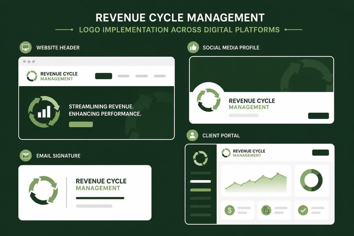
Implementing Logo Standards Across Organizational Touchpoints
Consistent application of your revenue cycle management logo across all client-facing materials reinforces brand recognition and professional credibility. Healthcare providers notice inconsistencies, which can raise concerns about attention to detail in billing operations. Systematic implementation prevents these perception gaps.
Digital Platform Applications
Website integration represents the most visible application of your logo. Header placement, footer inclusion, and favicon implementation all require adherence to established guidelines. Your logo should load quickly without sacrificing quality, particularly important for healthcare administrators accessing your site on various devices during busy workdays.
Social media profiles demand platform-specific adaptations. Profile images on LinkedIn, Facebook, and Twitter each have unique dimension requirements, but your revenue cycle management logo should remain recognizable across all platforms. Creating templates for these applications ensures consistency while meeting technical specifications.
Email communications from your RCM team should feature properly sized and formatted logos in signatures. Understanding logo usage guidelines helps maintain professionalism in everyday correspondence with healthcare clients, from routine billing updates to complex denial resolution discussions.
Print and Physical Material Standards
Business cards, letterhead, and promotional materials require vector-format logos for crisp printing. RCM companies frequently participate in healthcare conferences and networking events where these materials create lasting impressions. Poor reproduction quality on physical materials contradicts the precision healthcare providers expect from billing partners.
Marketing collateral for revenue cycle management best practices and educational resources should showcase your logo consistently. White papers, case studies, and service brochures all benefit from standardized placement and sizing that reinforces brand recognition across reader touchpoints.
Signage for office locations and trade show booths requires large-format versions that maintain visual integrity. Your revenue cycle management logo should scale effectively from small business cards to expansive conference banners without losing clarity or impact.
Color Psychology and Brand Perception in Healthcare Billing
Color selection for your revenue cycle management logo influences how healthcare providers perceive your organization's character and competence. The RCM industry occupies the intersection of healthcare and finance, requiring color strategies that honor both sectors' conventions while establishing unique identity.
Strategic Color Considerations
Blue Tones: Dominant in both healthcare and financial services, blue conveys trustworthiness, stability, and professionalism. Various shades offer differentiation-navy suggests authority and tradition, while lighter blues communicate approachability and transparency. Many successful RCM companies incorporate blue as a primary brand color for these associations.
Green Variations: Green connects to growth, health, and financial prosperity, making it particularly relevant for revenue cycle management. The color symbolizes both healthcare vitality and financial improvement, core promises of effective billing services. Medium to darker greens project sophistication appropriate for B2B healthcare relationships.
Supporting Accent Colors: Secondary colors in your palette should complement primary selections while adding visual interest. Orange suggests energy and optimization, purple conveys innovation and quality, and gray tones add professional balance. These accents appear in charts, graphs, and supporting materials that accompany your logo.
| Color | Primary Association | RCM Application Benefit |
|---|---|---|
| Navy Blue | Trust, Authority | Conveys reliability in billing accuracy |
| Healthcare Green | Growth, Health | Suggests revenue improvement and wellness |
| Financial Gray | Professionalism, Neutrality | Balances healthcare and financial elements |
| Accent Orange | Energy, Action | Highlights performance metrics and results |
Color consistency across all brand materials reinforces recognition. When healthcare providers see your distinctive color palette, they should immediately associate it with your RCM services, even before reading text or identifying your logo directly.
Typography Choices That Strengthen Professional Credibility
The fonts incorporated into or accompanying your revenue cycle management logo significantly impact professional perception. Healthcare providers expect billing partners to demonstrate precision and reliability, qualities communicated through thoughtful typography selections.
Font Categories and Their Applications
Serif Fonts: Traditional serif typefaces convey established authority and time-tested reliability. These fonts work well for RCM companies emphasizing experience and stability. However, they must remain highly legible at small sizes for effective logo integration.
Sans-Serif Fonts: Modern sans-serif options communicate efficiency, clarity, and forward-thinking approaches. Clean lines and excellent digital rendering make these popular choices for RCM logos appearing frequently on screens. They suggest streamlined processes and contemporary medical billing solutions.
Custom Typography: Unique letterforms or modified standard fonts help distinguish your revenue cycle management logo from competitors. Customization should enhance readability rather than sacrifice it for artistic expression. Healthcare audiences prioritize clarity over creative experimentation.
Font pairing strategies extend beyond the logo itself to all branded materials. Consistent typography across your website, proposals, and revenue cycle analytics reports creates cohesive brand experience that healthcare clients recognize and trust.
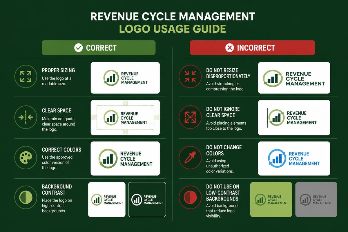
Protecting Your Brand Through Proper Logo Governance
Logo misuse threatens brand consistency and professional perception. Establishing clear usage restrictions prevents well-intentioned but harmful applications that dilute your revenue cycle management logo's impact and recognition value.
Common Misuse Scenarios to Prevent
Unauthorized Alterations
- Stretching or distorting logo proportions
- Changing approved colors to non-brand alternatives
- Rearranging logo elements or modifying spacing
- Adding effects like shadows, glows, or gradients
- Rotating the logo to non-horizontal orientations
Problematic Backgrounds
Your revenue cycle management logo requires sufficient contrast against backgrounds. Placing dark logos on dark backgrounds or light versions on light surfaces renders them invisible. Guidelines should specify minimum contrast ratios and provide alternatives for challenging background situations.
Competitive Context
Clear policies regarding logo placement near competitor logos or in shared vendor lists protect brand distinction. While healthcare providers often maintain vendor directories, your guidelines can suggest spacing or presentation preferences that maintain your brand's unique identity.
Educational resources for common logo mistakes help partners and employees understand proper usage. Logo usage guidelines often include visual examples of incorrect applications alongside correct versions, making standards immediately clear and actionable.
Integrating Your Logo Into Client-Facing Service Delivery
Your revenue cycle management logo extends beyond marketing materials into operational contexts where healthcare clients interact with your services. Strategic logo integration throughout service delivery reinforces brand presence while maintaining professional standards.
Client Portal and Software Interface Applications
When providing RCM services through client portals or practice management systems, your logo should appear consistently without overwhelming the user interface. Subtle header placement maintains brand presence while allowing healthcare staff to focus on critical billing data and claims processing information.
Report templates for revenue analytics, denial management summaries, and reimbursement tracking should feature your revenue cycle management logo in standard positions. Consistent placement trains healthcare clients to recognize your reports instantly, building familiarity and trust through repeated positive interactions.
Documentation and Communication Standards
Invoice templates, remittance advice summaries, and payment posting reports all provide opportunities for appropriate logo inclusion. These financial documents require professional presentation that reassures healthcare providers of accurate handling. Your logo serves as a quality seal on these critical communications.
Training materials and educational resources you provide to healthcare clients should display your revenue cycle management logo consistently. Whether discussing revenue coding best practices or explaining denial resolution processes, branded materials position your organization as the trusted expert guiding clients toward improved financial performance.
Evolving Your Logo While Maintaining Brand Equity
Market conditions, design trends, and organizational growth sometimes necessitate logo updates or refinements. However, revenue cycle management companies must balance modernization with preservation of established brand recognition that took years to build among healthcare clients.
Strategic Refresh Considerations
Evolution rather than revolution represents the safest approach to logo updates. Subtle refinements to typography, simplified elements for better digital rendering, or minor color adjustments maintain continuity while addressing legitimate improvement opportunities. Dramatic redesigns risk alienating existing clients who recognize and trust your current visual identity.
Legacy version management ensures smooth transitions when implementing logo updates. Providing clear timelines for phasing out previous versions prevents confusion in the marketplace while allowing reasonable transition periods for reprinting materials and updating digital assets.
Communication strategies should explain logo evolution to healthcare clients, emphasizing continuity of service quality and team expertise. Your revenue cycle management logo may change slightly, but the experienced professionals and proven processes behind it remain constant-this message reassures clients during visual identity transitions.
Leveraging Your Logo for Competitive Differentiation
The revenue cycle management industry features numerous competitors vying for healthcare provider attention. Your logo serves as a differentiating factor when medical practices evaluate potential billing partners, making strategic logo development an investment in competitive positioning.
Brand Recognition in Healthcare Settings
Healthcare administrators encounter multiple RCM vendors at conferences, through email solicitations, and via online searches. A distinctive, professionally designed revenue cycle management logo helps your organization rise above generic competitors. Memorable visual identity translates to top-of-mind awareness when practices need billing support.
Trust signals embedded in logo design reassure healthcare providers evaluating unfamiliar RCM companies. Professional execution, appropriate industry symbolism, and consistent application across touchpoints all contribute to perceived reliability. These visual trust indicators complement service quality, creating comprehensive credibility that wins client relationships.
Association with quality service delivery becomes embedded in logo recognition over time. When healthcare clients consistently receive excellent results from your medical billing and coding specialists, they develop positive associations with your visual brand. This accumulated brand equity makes your revenue cycle management logo increasingly valuable as your reputation grows.
Measuring Logo Effectiveness and Brand Recognition
Quantifying logo performance helps RCM companies understand branding investment returns and identify improvement opportunities. While visual identity metrics differ from direct revenue tracking, several indicators reveal logo effectiveness in building brand equity.
Recognition Assessment Methods
Client Surveys: Regular feedback from healthcare clients can include questions about brand recognition and logo recall. Simple queries about what organizations they associate with specific visual elements reveal whether your revenue cycle management logo achieves memorability among target audiences.
Market Testing: When launching logo updates or evaluating existing designs, A/B testing with healthcare provider focus groups provides valuable insights. Comparative assessments reveal which design elements resonate most strongly with medical practice decision-makers.
Digital Analytics: Website and social media metrics indicate how effectively your logo attracts and retains attention. Profile visit rates, click-through performance on branded content, and engagement with logo-featuring posts all suggest visual identity effectiveness in digital environments.
Performance Indicators for Brand Strength
| Metric | Measurement Method | Target Benchmark |
|---|---|---|
| Unaided brand recall | Client surveys asking about RCM providers | 30%+ among current clients |
| Logo recognition speed | Timed identification tests | Under 3 seconds |
| Brand consistency scores | Audit of materials across channels | 95%+ compliance with guidelines |
| Referral mention rates | Analysis of how new clients found you | 40%+ mention brand recognition |
These measurements help justify branding investments and guide ongoing refinement of your revenue cycle management logo and supporting brand materials. Continuous improvement based on concrete feedback ensures your visual identity remains effective as markets evolve and client preferences shift.
Coordinating Logo Strategy With Overall Brand Messaging
Your revenue cycle management logo functions as one component of comprehensive brand strategy that includes messaging, positioning, and service promises. Visual identity should align seamlessly with verbal communication, creating unified brand experience across all healthcare client touchpoints.
Message-Visual Alignment
If your RCM company emphasizes technological innovation and modern solutions, your logo design should reflect contemporary aesthetics rather than traditional imagery. Conversely, organizations highlighting decades of experience benefit from logos suggesting established authority and time-tested reliability. This alignment prevents cognitive dissonance that confuses healthcare providers evaluating your services.
Service differentiation strategies should inform logo development decisions. Companies specializing in urgent care revenue cycle management might incorporate design elements suggesting speed and efficiency, while organizations focused on complex hospital billing could emphasize thoroughness and accuracy through their visual identity.
Brand voice consistency extends from your revenue cycle management logo through all written communications. Professional, authoritative visual identity pairs naturally with confident, expert-driven content. Approachable, service-focused logos align with warm, supportive messaging that emphasizes partnership with healthcare providers.
Adapting Your Logo for International Healthcare Markets
RCM companies serving healthcare providers across diverse geographic regions must consider how their revenue cycle management logo translates across cultural contexts. While focusing primarily on United States markets, awareness of cultural symbolism prevents unintended negative associations.
Cultural Considerations in Logo Design
Color meanings vary significantly across cultures. While blue universally suggests trust and professionalism, other colors carry different connotations in various regions. Green might emphasize environmental consciousness in some markets while representing prosperity in others. Understanding these nuances prevents miscommunication when your RCM services expand into new healthcare markets.
Symbol interpretation requires careful evaluation. Medical symbols familiar in Western healthcare may not resonate internationally, while some imagery carries different meanings across cultural contexts. Research and testing prevent expensive mistakes when adapting your revenue cycle management logo for diverse audiences.
Language integration for bilingual markets demands thoughtful design. If your RCM company serves healthcare providers in regions with multiple languages, logo design should accommodate text variations without requiring complete redesign. Flexible layout systems maintain brand consistency across linguistic adaptations.
A strategically designed revenue cycle management logo supported by comprehensive usage guidelines establishes the foundation for strong brand recognition and professional credibility in the healthcare billing industry. By maintaining consistent visual standards across all client touchpoints, your organization demonstrates the same attention to detail that healthcare providers expect in billing operations. Greenhive Billing Solutions combines professional brand presentation with proven RCM expertise, delivering comprehensive billing services that improve financial performance while maintaining the transparent, trustworthy approach your practice deserves.

